The color palette generator that helps you see where a color could take you
Start with one color and explore palettes for interiors, websites, outfits, weddings and creative projects with Pink Dramatic’s free color tool.
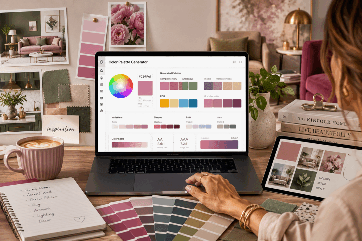
You know that moment when you find a color you absolutely love, but then have no idea what to do with it?
Maybe it is the deep dusty pink of a velvet chair you spotted while scrolling through interiors. A muted sage green from a kitchen you saved months ago. The warm terracotta of a hotel wall in Palm Springs. A dark plum that would look incredible on your bedroom walls, although you are not entirely sure what should happen to the rest of the room once you commit to it.
Or perhaps your problem has nothing to do with decorating your home. You are designing a website, putting together invitations, choosing colors for a small business, creating a Pinterest graphic, planning a party or trying to give your Instagram content a more recognizable look.
You already have the color.
The difficult part begins when that one color has to become a palette.
That is exactly why I wanted the Pink Dramatic color palette generator to start with something incredibly simple: one color.
You choose the shade you love, and from there you can explore what happens when you surround it with colors that actually relate to it. Instead of staring at hundreds of random swatches and wondering whether they belong together, you can move through complementary, analogous, triadic, split complementary, monochromatic, tetradic and square combinations. You can then soften the same color into pastels, mute it, brighten it, darken it or build an entire scale around it.
The idea is not to tell you which color you should love. It is to help you discover everything the color you already love can become.
It usually starts with one color you cannot stop thinking about
Imagine you are finally ready to change your living room.
For the past five years, you have played it safe. The walls are neutral, the sofa is neutral, the rug is neutral and somehow the entire room has reached that peculiar point where nothing is technically wrong with it, yet nothing makes you particularly happy either. If the room itself also feels difficult to arrange, these small apartment ideas can help you think beyond color without losing warmth or personality.
Then you see a color.
Maybe it is a rich blue green that feels sophisticated without becoming too formal. You can immediately imagine it on the wall behind your sofa.
Then reality enters the room.
Will it work with your cream sofa? What color cushions should you choose? Does it need warmer accents? Would another green make everything too green? Could you add pink without making the room look childish? Should the wood be pale or dark? And what happens when you bring in curtains, artwork and accessories?
Choosing one wall color suddenly becomes choosing twelve other colors.
This is where a palette becomes useful.
Enter your starting color into the generator and you can look at it through different color relationships. A complementary palette shows you hues from the opposite side of the color wheel, creating stronger contrast. An analogous palette stays closer to neighboring hues and tends to feel more cohesive. A monochromatic palette keeps you within one color family while changing lightness and depth. Triadic and other multi-hue combinations introduce more variety while retaining an underlying color relationship.
You do not need to know color theory before you begin. You can simply look.
That matters, especially with interiors, because the technically correct palette is not necessarily the palette you want to live with every morning.
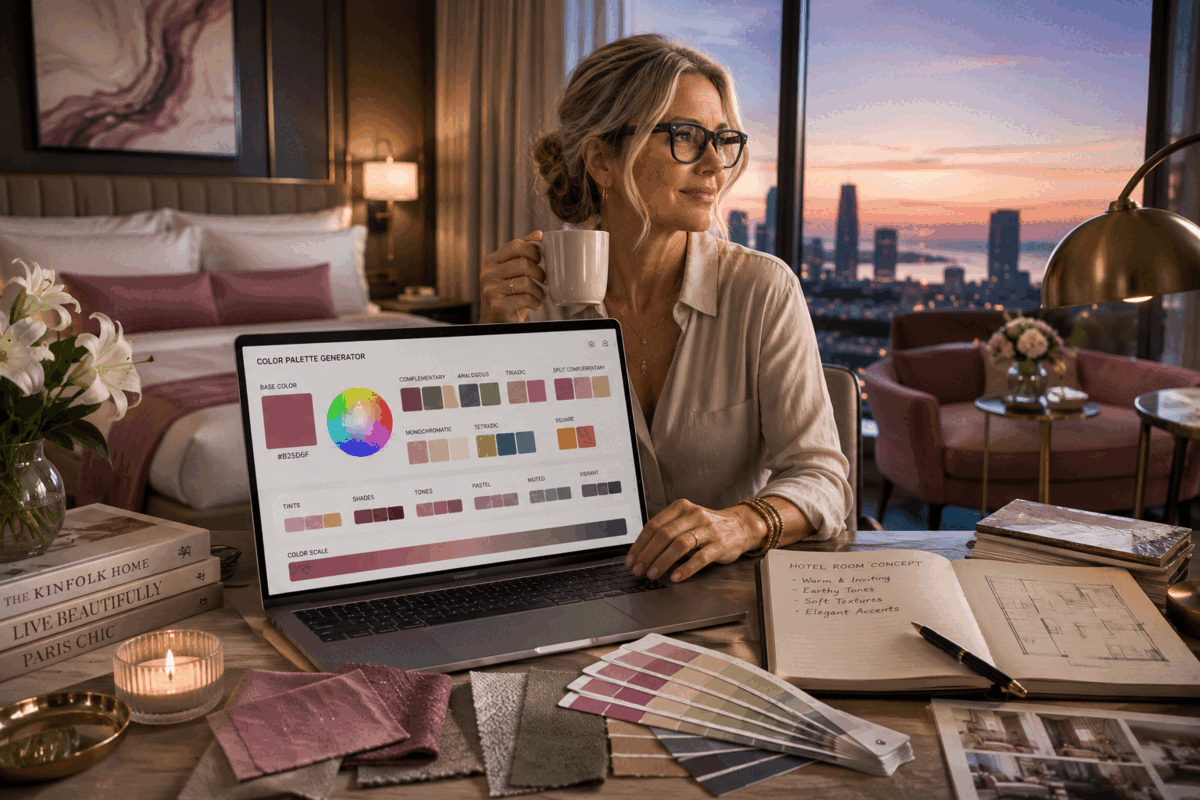
Your home does not need to look like everyone else's Pinterest board
There is a strange side effect to having endless interior inspiration available online. You can see thousands of beautiful homes and somehow end up feeling less certain about your own.
One week you want an earthy California interior with warm plaster walls. Then you see a dark, dramatic bedroom and suddenly everything needs to be burgundy. A few days later, an airy coastal house convinces you that perhaps you should have chosen pale blue all along.
A palette generator gives you a different starting point.
Instead of asking which interior trend you should copy, you begin with a color that genuinely appeals to you.
Suppose that color is burgundy.
You might discover that you love it with dusty pinks and muted reddish tones. Another combination might place it next to a contrasting green. Its lighter tints may suddenly suggest a soft bedroom palette, while its deeper shades could become the colors for furniture, frames or smaller accents.
The Pink Dramatic tool lets you take the same base color through tints, shades, tones, pastel, muted and vibrant variations. It also creates an eleven-step color scale, moving from very light versions of your chosen color through the original shade and into much darker versions.
That is useful when you want a room to feel layered rather than decorated with five unrelated colors.
You could use a pale version on a large wall, a deeper version on a cabinet and the darkest tone in smaller details. Your original color remains recognizable throughout the room, but everything does not have to match exactly.
That is often where a room starts to feel considered rather than coordinated.
The same little color problem follows you into your closet
Color decisions are not confined to paint cans and throw pillows.
You can have exactly the same problem standing in front of your closet.
You buy a beautiful raspberry blouse because the color looks fantastic on you. Then you get home and realize that you have absolutely no idea what else to wear with it beyond black jeans.
Put that raspberry color into the generator and you can start exploring.
An analogous combination may give you neighboring reds, pinks, purples or warmer hues. A complementary direction introduces much stronger contrast. Muted variations can help when the original shade feels too intense for an entire outfit, while lighter and darker versions can make layering easier.
You do not have to wear every color that appears in a generated palette. That is not the point.
You are looking for possibilities you might not have considered yourself.
The same approach can work when you are planning outfits for family photos, choosing wedding guest accessories, building a travel capsule wardrobe or trying to work out which shoes and handbag make sense with a dress you already own. The guide to styling pink accessories without looking overdone shows how one strong color can become the detail that pulls an outfit together.
Color becomes much easier when you stop treating every choice as an isolated decision.

Then there is the woman staring at her website at 11:47 p.m.
She knows something is wrong.
The logo looks fine. The photography is good. The copy is finished. Yet the website still does not feel right.
The background is slightly too cold. The buttons seem disconnected from everything else. The heading color looked beautiful when she selected it, but now it feels heavy. She has changed the accent color six times and can no longer remember which version she preferred.
If you have ever designed your own website, Etsy branding, newsletter, online store or portfolio, you probably know this particular rabbit hole.
Color on a screen has another complication: it has to work, not merely look beautiful.
That is why the generator gives you the HEX, RGB and HSL values for generated colors and lets you copy colors directly. It also includes a gradient generator that turns two HEX colors into ready-to-copy CSS.
For a web designer, those details turn visual experimentation into something usable.
You can begin with a client's brand color, generate related options and use them to think about backgrounds, buttons, navigation, cards, hover states and accents.
For someone who is not a web designer, you can ignore most of the technical language and use the exact same tool visually.
That was important to me. Color should not suddenly become inaccessible simply because somebody does not know CSS.
A beautiful website still has to be readable
There is another reason I did not want the generator to stop at attractive swatches.
Some color combinations look gorgeous next to each other and become awful the moment you put text on them.
That soft blush background and delicate gray lettering may look elegant on your screen, but can someone comfortably read it? Does white text actually have enough contrast against your favorite pink? Is the darker version better?
The generator includes a contrast checker so you can compare a background color with a text color. It calculates the contrast ratio and shows whether the combination passes WCAG AA and AAA targets for normal and large text.
That distinction matters because color harmony and readable contrast are not the same thing. Other professional palette tools make the same point: colors can have a valid mathematical relationship on the color wheel while still producing insufficient contrast for text.
You can therefore fall in love with a palette and still check whether people will actually be able to read what you put on top of it.
For bloggers, web designers, small business owners and anyone creating digital content, that is not an optional detail hiding somewhere at the end of the design process. Readability is part of the design.
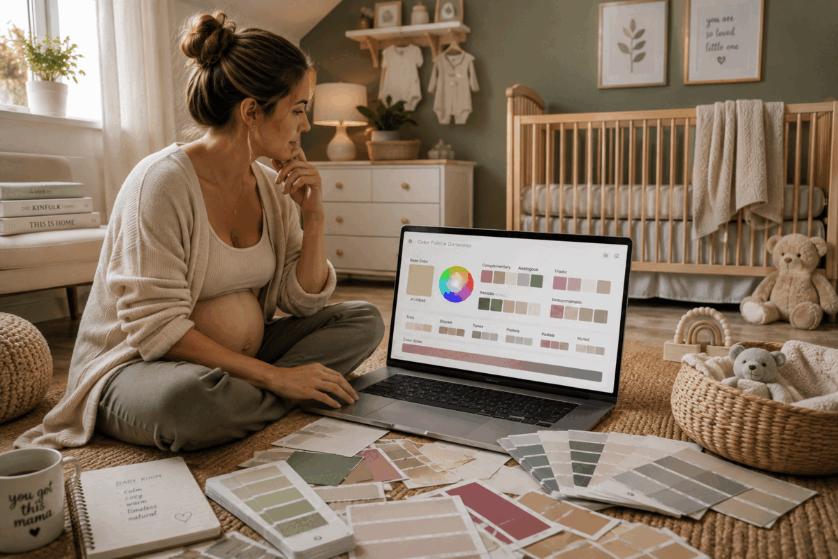
Your wedding invitation can begin with the flowers
Maybe you are not redecorating anything and have never opened a CSS file in your life.
You are planning a wedding.
You already chose peonies in a particular dusty rose. Now you need invitations, table cards, napkins, candles, bridesmaid details and perhaps a wedding website.
Instead of searching for "dusty pink wedding palette" and choosing the same pre-made combination thousands of other people have already saved, you can begin with the actual shade you chose.
Suddenly your flowers become the anchor.
The lighter variations could inspire paper and backgrounds. A darker shade might work for lettering. A complementary or split-complementary color can suggest an accent that stops everything from becoming one enormous cloud of pink.
The same principle works for birthday parties, baby showers, dinner parties, graduation celebrations and holiday decorating.
One real color can become the thread that runs through everything.
Creatives can use color before they know exactly what they are creating
There are days when you know what you want to make. There are also days when you simply know how you want it to feel.
That is where playing with color becomes interesting in its own right.
A photographer might start with a dominant color from an image and explore what could complement it in a graphic. A content creator could build a visual direction for a new series. Someone making digital invitations can find an accent color without scrolling through endless templates. A crafter can work out which papers, fabrics or threads belong together.
You can even use a palette as the beginning of a mood board.
Start with that warm peach you keep noticing. Generate its analogous colors. Switch to complementary. Look at the muted version. Compare it with the pastel variation. Move into darker shades.
You may arrive somewhere completely different from where you expected.
That is part of the fun.
Color changes when you give it context
A tiny swatch can be deceptive.
A dark green square on a white screen may look gorgeous. Cover an entire wall with it and suddenly you experience the color very differently. A bright coral might seem exciting as a sample but overwhelming when used everywhere on a website.
That is why I like moving beyond the isolated color chip.
The generator includes a palette preview where you can see background, text, accent and action colors together.
You begin to see a palette as a relationship instead of a collection.
This is particularly useful when you are the kind of person who can immediately say, "I love that color," but has a much harder time answering, "Where should I use it?"
Perhaps the brightest color belongs on a button rather than across an entire background. Maybe the palest tint becomes the wall color while the original shade belongs on a chair. Maybe the darkest tone should be reserved for typography.
The palette does not make those decisions for you.
It gives you enough visual information to make them yourself.
You are allowed to change your mind twenty times
One of my favorite things about choosing colors digitally is that there is no paint drying on the wall while you reconsider your entire personality.
Experiment.
Take the color you thought you wanted and make it softer. Make it darker. Put it next to its opposite. Try the combination you were certain would look terrible. Switch to monochromatic. Go back. Copy the HEX code of something unexpected.
You have lost nothing.
There is freedom in being able to explore color before committing money, time or an entire Saturday afternoon to it.
If you are planning an interior, you can use the palette as a starting point before ordering paint samples. If you are designing online, you can copy the actual values into your project. If you are planning a creative project, you can save the colors you want to work with.
The tool runs in your browser, and the color calculations happen there rather than requiring you to upload your choices somewhere else.
Most importantly, you do not need to arrive knowing what the finished result should look like.
You only need one color.
Start with the color you already love
Maybe yours is the faded blue of your favorite jeans. The warm cream of an old hotel. Deep espresso brown. Cherry red. Sage. Butter yellow. Dusty rose. A very specific shade of pink that you cannot name but recognize immediately whenever you see it.
That is enough.
Open the free Pink Dramatic color palette generator, choose that color and see where it leads.
Try its opposite. Look at its neighbors. Turn it into a pastel. Pull it toward something muted. Explore its darkest shades and palest tints. Check whether your text remains readable. Build a gradient. Look at the palette together rather than judging every swatch separately.
You might end up with the colors for your living room.
You might finally know what your website has been missing.
You might find the palette for a wedding, an outfit, a brand, a bedroom, a Pinterest graphic or a project that does not even have a name yet.
Sometimes you do not need more inspiration.
You just need to see what was hiding inside the color that caught your eye in the first place.
Start with the color you already love
Choose one shade, compare its harmonies and variations, check contrast and preview how the palette works together.
Open the free color palette generator →