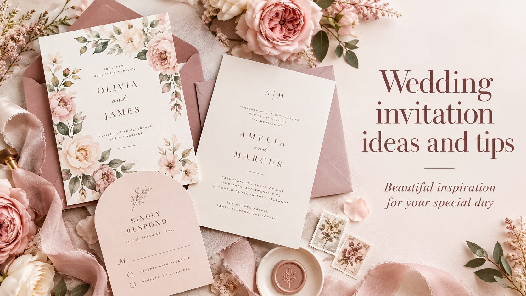
Pink Dramatic weddings
Wedding classic romance
Discover classic romance wedding invitations, save the dates, ceremony stationery and reception details with timeless florals, elegant script, vintage influences, black and white styling, bows and refined romantic color palettes.
 Sage Green Vintage Floral Romantic Garden Wedding Invitation
 Vintage Floral Black Rustic Kraft Boho Wedding Save The Date
Explore classic romance wedding styles
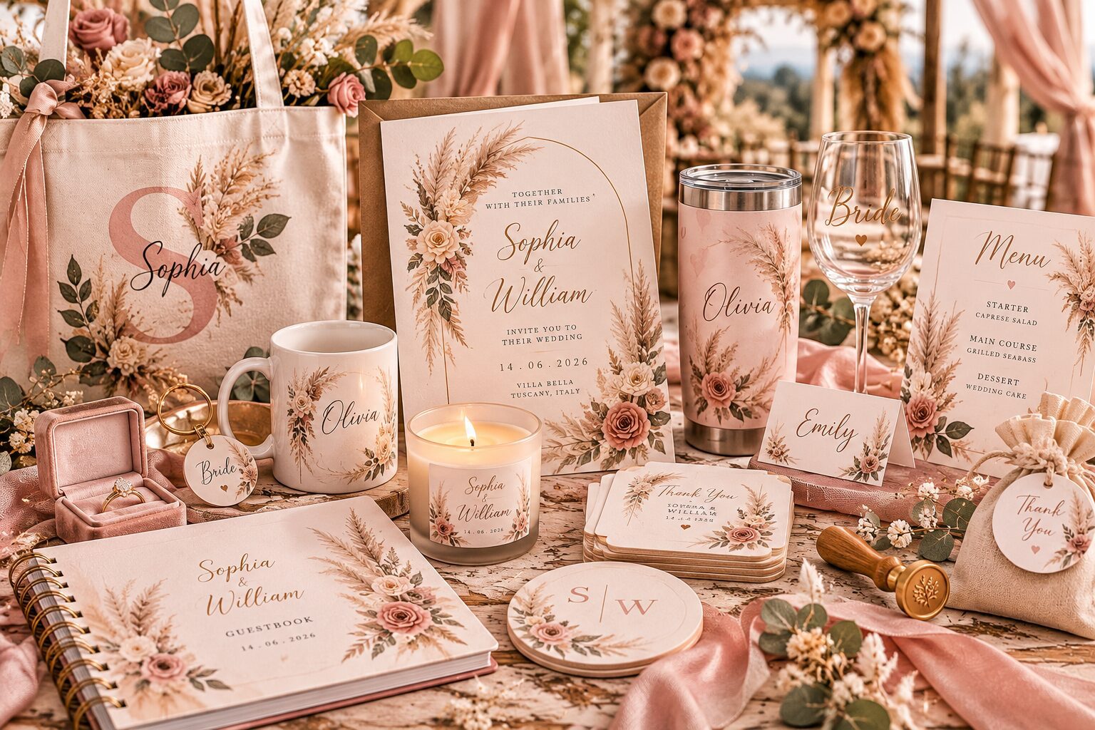
Classic romance wedding ideas with timeless details
A classic romance wedding focuses on details that still feel elegant years after the celebration. Floral borders, refined script, soft color combinations, traditional layouts and carefully chosen paper details can create a romantic atmosphere without relying on short-lived trends. The products above bring together invitations, save the dates and other wedding pieces that work within a classic romantic direction, while still allowing you to personalize names, dates, photographs, monograms and event wording.
Current Zazzle classic romance designs include soft florals, vintage-inspired artwork, elegant neutral palettes, deep navy with gold, sage foliage and black-and-white styling. The style can be delicate and feminine, formal and dramatic, or quietly traditional depending on the colors and typography you choose.
Classic romance wedding invitations
The invitation is usually the strongest visual introduction to a classic romance wedding. Floral frames, serif typography, handwritten script and symmetrical layouts can make the design feel timeless, while photographs or modern paper shapes can keep it personal. Blush, ivory, champagne, sage, navy and black are especially effective because they pair easily with both traditional and contemporary wedding decor.
If you want to compare a wider range of designs, browse personalized wedding invitations. Use the classic romance direction when you want the stationery to feel soft, elegant and enduring rather than strongly tied to one trend.
Classic romance save the dates
Save the dates can stay simpler than the invitation while still introducing the wedding palette. A single engagement photo with elegant script, a floral border or a quiet neutral background can communicate the romantic style immediately. If you prefer a more traditional look, use typography and ornament without a photo. If the couple is the focus, keep decorative elements light so the image remains prominent.
The save the date and invitation do not need to match exactly. Repeating one font family, floral direction or color is enough to create continuity across the stationery.
Gothic classic romance
Gothic romance introduces deeper colors, dramatic florals, vintage details and stronger contrast while keeping the wedding elegant. Black, burgundy, plum, antique gold and ivory can create a moody palette that still feels formal. Ornate borders, dark botanical artwork and old-world typography work especially well for evening weddings, historic venues and autumn or winter celebrations.
The key is balance. A dark background can make the design feel dramatic, but the practical information should still be easy to read. Use lighter text and avoid placing small script directly over detailed artwork.
Retro classic romance
Retro romance can use vintage florals, mid-century typography, nostalgic illustration or colors that feel inspired by another era. Soft blue, dusty rose, faded red, cream and warm green can create a romantic vintage look without turning the wedding into a costume theme. Retro details work particularly well when the venue already has historic architecture or when the couple wants a more distinctive alternative to standard modern stationery.
Choose one period influence and keep the rest of the design simple. Mixing too many eras can make the stationery feel inconsistent rather than intentionally vintage.
Black and white classic romance
Black and white wedding stationery is one of the most flexible classic choices because it can feel formal, editorial, minimalist or vintage depending on the typography. A black border with white space creates a clean traditional result, while black backgrounds and white lettering create stronger evening drama. Floral line art can soften the contrast without adding another color.
Black and white also leaves room for flowers, ribbons, table decor and venue details to provide the color. This makes it useful when the wedding palette has not been finalized yet or when you want the printed pieces to remain neutral.
Bow wedding details
Bows add a romantic decorative detail that can feel preppy, feminine, vintage or formal depending on the material and color. Printed bow illustrations, ribbon-inspired graphics and soft tied details can appear on invitations, save the dates, menus or favor tags. Blush, ivory, black and pale blue bows work especially well within a classic romantic palette.
Use the bow as an accent rather than covering every product with the same motif. One repeated detail across the invitation suite is usually enough to make the wedding stationery feel connected.
Elegant floral romance
Florals are central to many classic romance weddings because they can move easily between soft, traditional and luxurious styles. Roses, peonies, blossoms, greenery and garden flowers can frame the names or sit in one corner of the design. Watercolor florals feel softer, while line art and engraved botanical styles can look more formal.
If the floral artwork is already detailed, keep the typography restrained. A clear serif font for information combined with a script for names usually gives enough contrast without competing with the flowers.
Romantic wedding color palettes
Classic romance palettes often start with one soft neutral and one or two accent colors. Champagne with sage creates a refined natural look, blush with ivory feels lighter and more feminine, navy with gold works well for evening weddings, and black with white creates a strong formal base. Dusty blue with cream can feel vintage, while burgundy with antique gold gives the wedding a deeper seasonal character.
If you want to compare combinations before choosing stationery, use the Pink Dramatic color palette generator. Test the main stationery color, one floral or decorative accent and one neutral before repeating the palette across the rest of the wedding.
Classic romantic wedding programs and menus
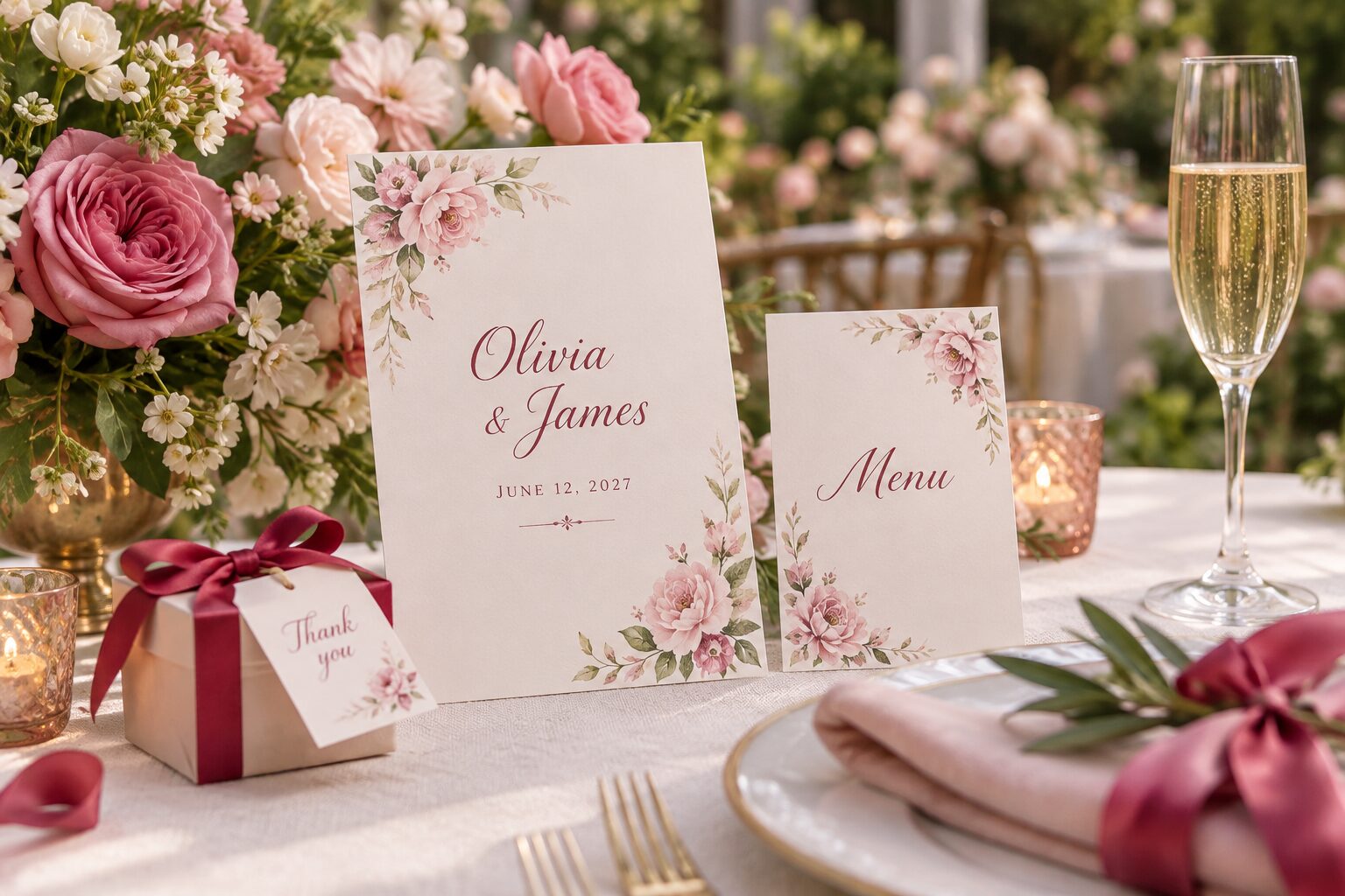
Programs and menus should continue the invitation style without becoming difficult to use. A program can repeat the floral border, monogram or script heading while giving the ceremony order enough space. Menus can use the same colors and typography, especially when they sit directly at each place setting and become part of the table design.
When there is a lot of information, reduce decorative artwork rather than shrinking the text. Guests should be able to read the ceremony order, meal courses and drinks comfortably.
Reception signs and classic romance details
Welcome signs, seating charts and bar signs can carry the same romantic direction through the reception. A large floral frame may work beautifully on a welcome sign, while a seating chart needs a clearer layout because names and tables must be found quickly. Keep the heading style consistent but adapt the amount of decoration to the function of each piece.
For more related stationery categories, visit Invitations & Announcements. This helps you move between wedding-specific products and broader stationery without leaving the Pink Dramatic structure.
Classic romance wedding cards
Wedding cards can continue the same visual language after the ceremony. Thank you cards with a wedding photograph, soft florals or elegant script can connect naturally to the invitation suite without needing to copy it. A black-and-white wedding photo can also pair well with classic typography and neutral card stock.
For more card designs, browse personalized greeting cards. Reusing one color, floral detail or monogram is enough to make the thank you card feel part of the wedding stationery family.
Keep classic romance personal
Timeless does not need to mean generic. Photographs, handwritten-style names, a meaningful flower, a family monogram or colors connected to the venue can make classic stationery feel specific to the couple. Personalization works best when it supports the design instead of filling every available space.
Choose the detail that matters most and let the rest of the design stay calm. This creates a wedding look that feels romantic now and still looks considered when the invitations and photographs are revisited years later.
Check every personalized wedding detail before ordering
Review names, dates, times, venue details, RSVP information, photographs and custom wording before ordering. Classic romance designs often rely on precise spacing and delicate typography, so a longer name or changed address can affect the balance of the layout. Check the complete preview after every edit rather than assuming the sample arrangement will remain unchanged.
The products above give you a broad classic romance wedding selection, while the page navigation continues through more Zazzle results. Use the style blocks to narrow the collection to gothic, retro, black and white, bow and other classic romantic wedding directions.